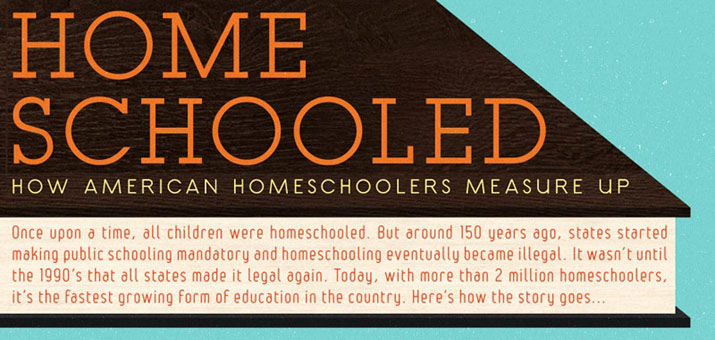
There are lot of debate on whether public school is better or homeschooling? I guess it is personal opinion, but here is fun info graphic to see in fun image how public school and homeschooling are stacked against each other. You be the judge! As a homeschooling parent, I am bit biased though.
It is always interesting to compare data together and analyze and see what you have chosen comes out at the top. In this info-graphic, there is a comparison between homeschooling kids vs. public school kids and you can see it based on this hightlight facts below;
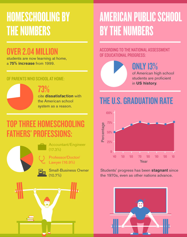
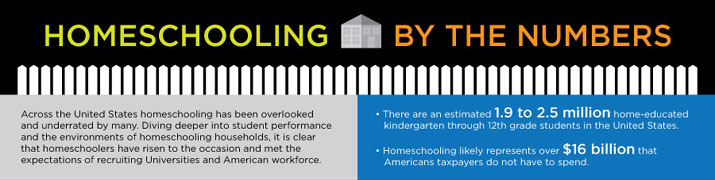
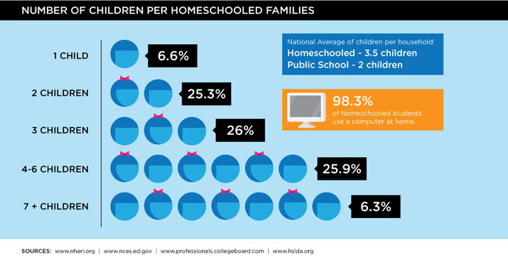
Homeschooling By Numbers:
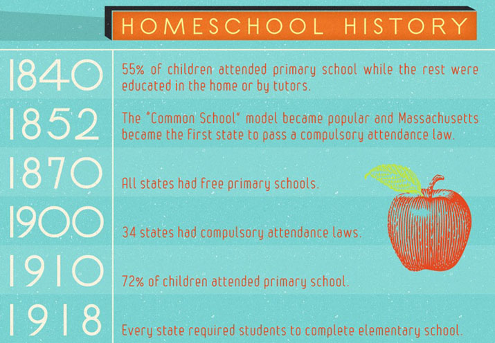
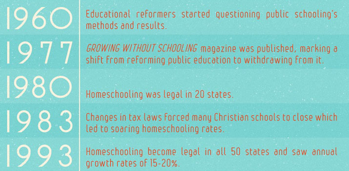
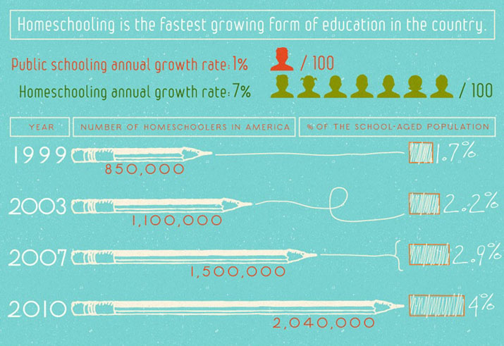
Over 2 Millions are homeschooling now : 75% increase since 1999
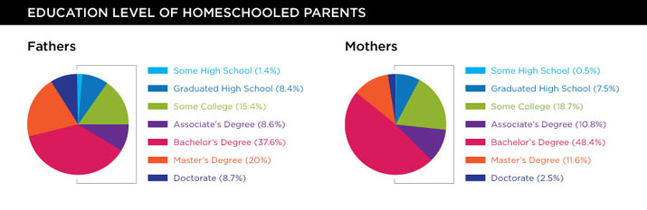
Top 3 Homeschooling Father’s Profession:
- Engineer/Accountant
- Professor/Doctor/Lawyer
- Small Business Owner
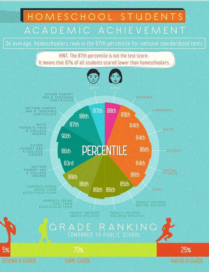
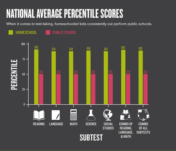
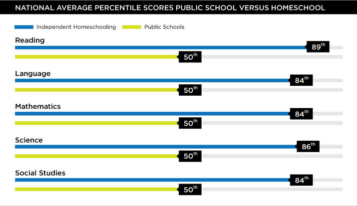
National Average Percentile across Subjects:
- Public school Avg. 50%
- Homeschooling Avg. 86%
GPA Comparisons:
- Public School : FreshMen 3.12, Seniors 3.16
- Homeschooler: FreshMen 3.41, Seniors 3.46
Graduation Rate Comparison:
- Public School: 57.5%
- Homeschooler: 66.7%